
Have you ever checked if your website is optimized for modern day’s mobile devices or they are still stuck to the old fashioned desktops? If you have not updated your website according to the modern trend, then your website must have lost somewhere. Thanks to the new generation technology that allow users to get connected to their favorite websites through the power of their palm. But if you have not made your website optimized for the modern gadgets like iPhone, android phones, iPad etc. then you are at a very big loss.
Here are some points that will help you in minimizing the size of your website for maximizing the size of your business. These mobile versions of your websites help you in reaching your potential customers fast and easily. From the year 2011, no one keeps on sitting on the desktops waiting for the website to show its colors. Now the customer can browse the website at any corner of the world. This is the reason it is critical to make your website mobile friendly. Here are the steps how you can do it:
1. Google AdWords helps you in searching the appropriate keywords that are accurate for mobile devices and will help you in narrowing down exactly what keywords do your business need to reach to the instant consumer.
2. Use the same SEO formula that is being used for optimizing a normal website and optimize your website for the mobile users. Use your mobile keywords and create some meta titles, headers and title tags, etc.
3. Do not overload your reader with the stuffy content. Keep the content for mobile websites short and précised. Make sure that the images are smaller in order to help your instant consumers with the best mobile experience possible.

4. Make sure that you chose nice fonts which are clear and easy to read. Directions buttons should be bigger. Always keep in mind that everything is going to be seen on the smaller screen.
To help your instant consumers to land on the mobile version of your site help those to stroll down the street reading their smart phones. You need to do some quick revamping of your website make your website mobile friendly to computer friendly.
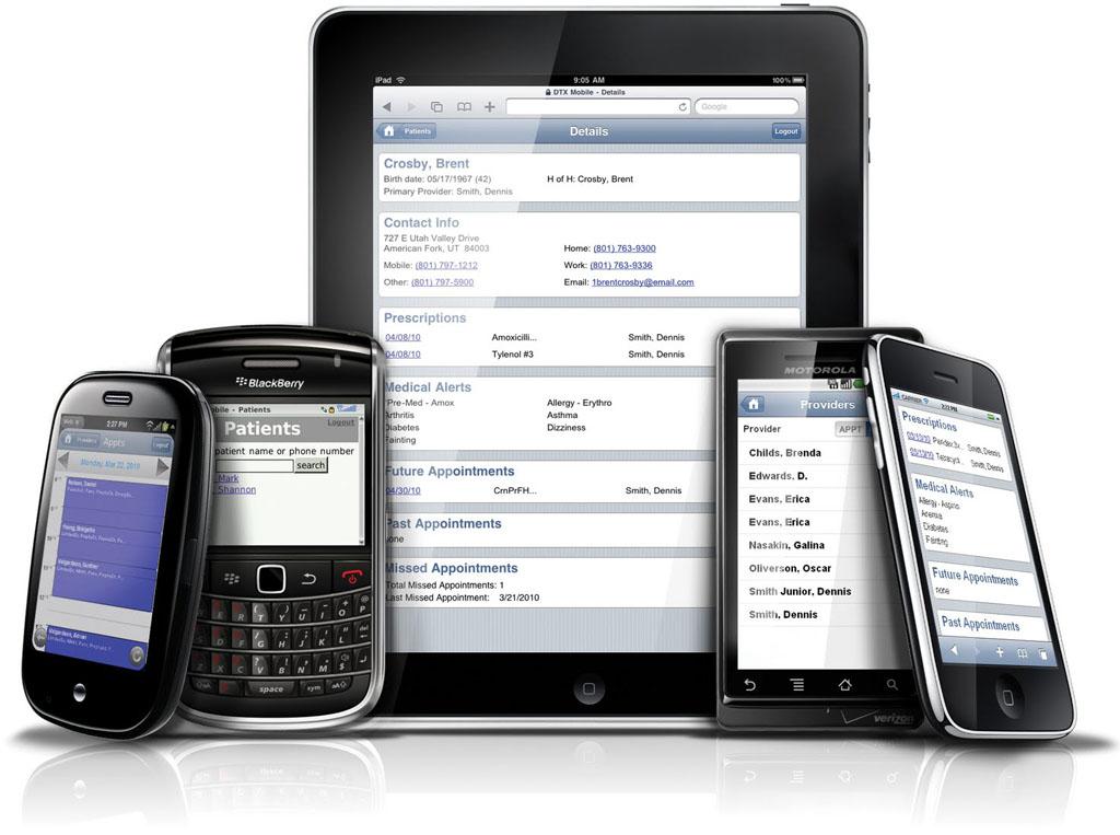
Most of the websites have two URLs: one for desktops and one for mobile phones. The major SEO advantage in having a mobile version of your website is that now Google has designated both that will look for mobile based URLs to index.
To-Do List for Making Your Website Mobile Optimized
1. Remove the duplicate content by making changes with the CSS so it should get optimized for mobile viewing.
2. No Flash is required. Use of flash makes sure that there is some redirection to your mobile site from the tablet.
3. Do not overwhelm your visitors with lengthy scrolls instead include “Previous” and “Next” buttons for their convenience through the content and the WebPages.
4. Always create an application for e-commerce pages and store information to avoid any type problem with the loading time or heavy website issues.
5. Optimize the check out time for your visitors and use cookies, Pay pal and postal codes.
6. Make your website touchable by using CSS3 and HTML5 for creating a scrolling and horizontal navigation so that all the content should lie on a single page and should not give its visitors a mobile attack.
7. Add CSS to your website. This will increase the size of the buttons present on your page. This will help you in making your site more attractive and user-friendly from the mobile perspective. No one really zoom to that close.
8. Offer your readers a download button for the content. Also create PDF version of your website or any important information. If they like your content this will help them in storing your content for longer.
9. Always keep in mind the 5 viewing angles which are landscape and Vertical in your mobile device and tablet, and the simple desktop view. Take advantages of the viewing options that are given.
10. Test, Test, and Test – Test again and again to make sure that your website is good enough and gives a long lasting impression to your clients.
Optimizing your website design and look for mobile devices are highly recommended to reach your potential customers easily. World is getting mobile hence it is important for you to be present on the mobile devices always.
Bài viết liên quan

Most Innovative Apps That Changed the World
Every year there’s a new app sensation that changes the way we’re used to do something. We’re always waiting...

Kids’ Mobile Addiction – Use Cell Phone Parental Control To Take The Toll On It!
There are many who confess that “I’m hooked on mobile”. But saying that doesn’t make them a mobile addict....

Be the Envy of Your Friends with a Unique iPhone 5s Skin
Your iPhone 5s (https://www.apple.com/iphone-5s/) default skin looks pretty plain when you take it home from the store. It’s time...